Blog: UX examples
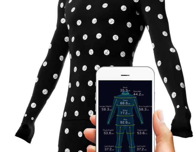
An experience: Zozo custom-fit
Ever had this feeling fashion brands simultaneoulsy changed their size charts overnight, leaving you with the choice between too big or too small items? Shopping for clothes can be difficult for anyone who doesn’t fit the standards… meaning almost everybody, let’s be honest. A clothing company named Zozo has developed a innovative system to make shopping great again, in an innovative, personnalized and digital way. And it all starts with a black spandex suit and a mobile app…
Great Forgot Password process and UX
Oups, forgot my password again. This is no surprise: we have more and more accounts on more and more websites. Some accounts we have created a while ago, and all of sudden the website remembers us we do have an existing account with them. Right. But what was my password again? All websites offer a standard Forgotten password link, but what happens next vary, with some websites offering a much better service than others. This morning I found a very nicely done Forgotten-password process and interface while browsing laredoute.com.
Etam.com: a bad shopping experience
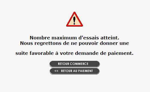
When it comes to e-commerce, best practices are well-known and studied, and most websites now apply them. But, more important than a one-click purchase, attractive product pictures, clear delivery options and fees, there is something that you can’t afford to fail. The purchase process simply has to work. From A to Z. This morning, I tried to purchase several T-shirts on a famous clothes store in France: etam.com. Here is a 3-steps failures story that made me, in the end, abandon my shopping, a 80 euros shortfall for the brand.
Information design example: cursors and comparison
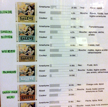
Last week end, my boyfriend and I were looking for a nice bottle of wine to bring our friends at a dinner. At the wine shop, we discovered a local brewery, called La Brasserie du Mont Salève. They had a lot of different flavors, and a very interesting way of presenting them, with cursors highlighting color, flavor and strength. A good example of information design several good practices:
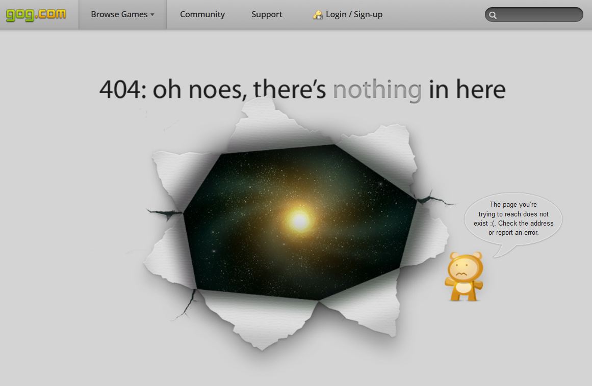
404 Error Pages: UX best practices
Uh oh, sorry but the page you are looking for cannot be found… Should a 404 error page stop with these very basic words? Nowadays 404 pages have become a creative challenge for websites, and some, like Gog.com or Blizzard.com, have really put some work to create unique and original pages. (There is also Videotron‘s unicorn… The simplest is to check benchmarks like 404notfound.fr.) But creativity is not the core objective of these pages, is it? When you look at the context, 404 pages appear when the user hastried to access a page that does not exist. It could be a mistake in the URL or a broken link on your website. This makes the 404 page’s main objective to redirect the user to relevant content, and avoid him closing the website and leaving forever. Here are a few ideas to improve 404 pages and go over the dead-end they once represented.
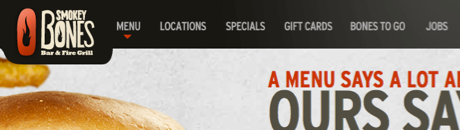
Nice ideas to accompany scrolling
Do users scroll down the pages of our websites, or do they not? That is definitely a good question to be asked. Nielsen still rules, with his 80-20 theory: 80% of users’ attention is focused on the first 20% of the page. Though, some websites choose huge vertical layouts and parallax scrolling. Without going as far as The World’s Longest Website (which is quite extreme), some websites use parallax very well. Personnaly, I love Smokey Bones website. Why not scroll, afterall… The UX in me just advises to help users while scrolling down. And here are a few ideas I gathered for not letting users down… the page unattended.