UX mobile and responsive
With Internet users surfing more and more from their smartphone, the question of screen resolutions has become a major [...]
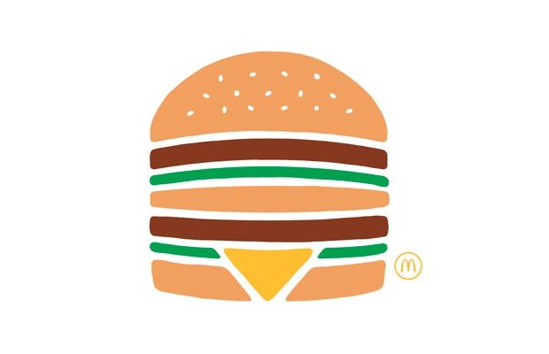
Burger or not burger? These 3 parallel lines are an easy way to represent a navigation menu. Or at least they used to be for designers. This picto has been an object of doubt and controversy for some time. Blocking discoverability, not significant enough for users… I recently worked on a radio mobile application, and one of our concepts was relying on a burger menu for main navigation. Was it usable? Well, the best was to know was to ask users, so I conducted a little user testing on the topic.
The design and UX team came up with several options for the main navigation. Some options were based on a burger picto, and some others featured other ideas, like the term « menu » in letters, or other pictos, including or not animation effects on the button. 15 users were presented a randomly selected option along with the test scenario: « This app lists all shows, and allows you to listen to the latest edition. From this screen, how would you proceed to listen to your favorite show? » (I have to precise the navigation was the only way to access this feature, and that a tab bar was not among the considered options.) Users were then asked to comment on their thinking, and estimate how easy they found the task.
1. Navigation options based on a burger picto met 100% success.
2. Users undoubtedly and immediately identified the burger picto as an access to the list of contents and features of the app.
3. The term « menu » was never used by any user to describe their thinking process.
The results were unquestionable: each option featuring a burger picto to access the navigation was met with a 100% success rate for the proposed task. All other options, including the « menu » label, met 0 to 20% success. Once presented with the scenario, users did not think for more than 1 second before clicking on the burger, wherever it was located on screen, and whatever its size. When asked to comment, all users mentioned how obvious it was, that they were absolutely certain to find a list of features and contents by clicking on this picto. For all other options, uncertainty and hesitation was observed, and success was uncertain.
The results of my little user test show that (like it or not) the burger has become a standard code for menu in the eyes of many users. It may not always be the best option for mobile navigation, but it remains an option to consider.
With Internet users surfing more and more from their smartphone, the question of screen resolutions has become a major [...]
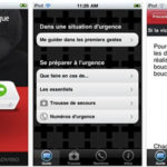
Quebec Amerique First Aid application for iPhone was the first mobile application I ever worked on. The application was [...]

Discover the numerous benefits of low and no-code platforms for UX, through the 5 stages of Design Thinking - Includes [...]