Screen resolutions 2014
Mobile and tablets made appear a lot of new resolutions. Though, we still need to improve interfaces for « normal » [...]

One of my clients recently came to me with a big table of raw data. He was a bit challenged by the fact that all the right data was properly collected and presented in this table, though users did not seem to be able to read the data. Even more challenging was the fact that the data actually came from them initially, but they had trouble even understanding the table itself, let alone make the decisions it was supposed to help them with. What was the problem there? When it comes to data visualization, tables are more often than not underestimated, to the benefit of good-looking graphs. But the choice between tables and graphs is not always that automatic.
A table format is the standard readable output from a database. It is a simple way to present different formats and units of data in one single element, and allows easy comparisons as well as quick scanning of precise individual values. Things get a bit more complicated when we start talking about big data and a lot of lines and columns. No wonder a lot of users like their tables printed for cautious scanning and color-underlining.
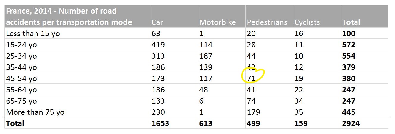
Above: In this table, it is easy and quick to get the exact number or road accidents for pedestrians between 45 and 54 years old. But is it a lot? What does it represent compared to cyclists or motorbikers? Interpreting the data actually requires to read it all, one figure at a time.
Javascript libraries like KendoUI or many others propose ready-to-implement data visualization graphs for web apps. From pie-charts (now despised, we will talk about them in another post) to doughnuts or bar charts, there are a lot of very creative ways to present data. Graphs are great to highlight a concept, a trend or an exception, making it visually obvious without requiring reading and data interpretation. They are more elaborate than a plain table, and can be inserted in layouts or presentations. Caution: trying to put too much information in one single graph can quickly turn an easy chart into a mess.
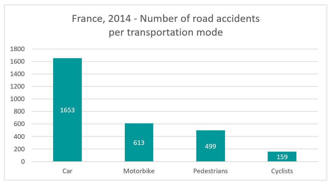
Above: Simple bar charts can highlight proportions. This graph shows clearly that car accidents are clearly more numerous than other transportation modes.

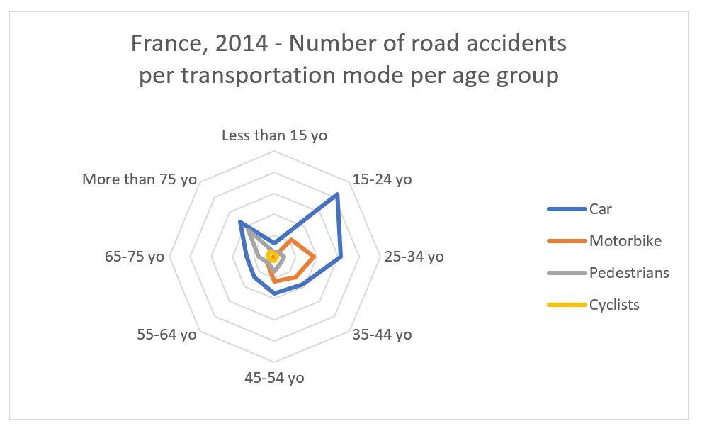
Above: A graph can do much more! This radar example highlights risk profiles: 15-24 and 25-34 years old are clearly at risk for car accidents, 25-34 yo for motorbiking accidents, and more than 75 yo as pedestrians.
The first step is always to understand the data itself. It is mandatory to be able to identify the key information, gather and prioritize pieces of data. What does the data tell you? What is important and what is not? Once you understand that, a bit of user research will tell you what users need to do with the data, and how they are used to reading it. Once you know all that, you can choose the data visualization best adapted:
Choosing a table is only the first step. There is a lot you can do to make data in a table easier to scan and read. The solution I recommend is often a table basis with graph elements, used to highlight trends, exceptions and cues. Because that’s what you are usually looking for in data: (1) if it’s right or problematic, (2) if it’s going in the right direction, and (3) if there is a disruption at some point. Visual cues can help highlight these, along with the precise data then allowing users to dig deeper.

Above: This augmented table highlights the 3 age groups with the most road accidents for each transportation mode. The whole data is available, and visual cues help get an interpretation at a glimpse.
The type of data visualization to use is tailored to specific needs in each case. Charts and graphs are more visual and fancy for presentations, but it should not be an automatic choice, as tables can be developed into much more developed items, highlighting important information and giving cues for data reading.
