Footer optimization
Big or small footer? I recently came to this question regarding an oline news website: is it stil a good thing to offer [...]
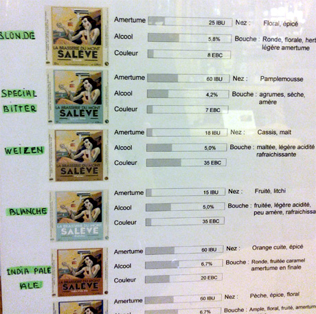
Last week end, my boyfriend and I were looking for a nice bottle of wine to bring our friends at a dinner. At the wine shop, we discovered a local brewery, called La Brasserie du Mont Salève. They had a lot of different flavors, and a very interesting way of presenting them, with cursors highlighting color, flavor and strength. A good example of information design several good practices:
Big or small footer? I recently came to this question regarding an oline news website: is it stil a good thing to offer [...]
I have been asked a question about accessibility recently, and I realized it has been a long time since I’ve last [...]

Capitaine Commerce has recently published their French e-commerce conversion barometer for 2016. More than 400 [...]