Blog: Axure
Circular progress bar in Axure

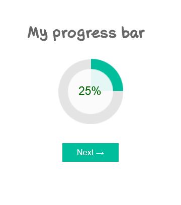
Data visualization is a more and more important part of UX projects nowadays, and an aspect of UX that I am really fond of. Among other elements of data visualization and dashboards, I have found myself recommending circular progress bars several times. Though, it is not an easy element to design within Axure, and referring to other softwares to design and edit my widgets was a bit inefficient. In this article, I propose an Axure source with a circular progress bar as a Master, that you can copy and paste directly in your own design. I won’t go as far as step-by-step tutorial, as it is ready to use, but simply explain a few of the possible options from this master.
Sticky element in Axure

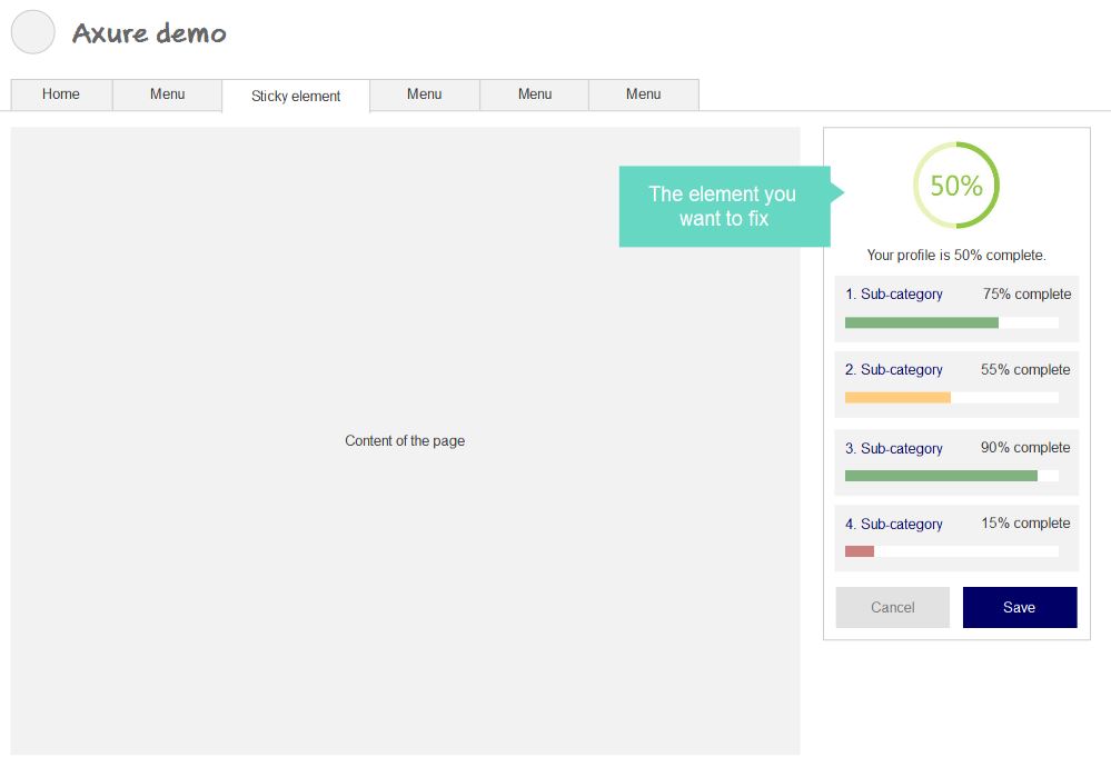
In a previous article on the blog, we have seen how to prototype a fixed-positioned menu in Axure. I realized this was a bit of a specific case, as the horizontal menu takes the whole page width, which makes it kind of easier. In this new tutorial, I propose to follow a step-by-step process to prototype a sticky element in the page. As a reminder, this applies when a simple Pin to browser is not sufficient, especially when the element to fix is not exactly on top of the page.
Fixed position menu in Axure

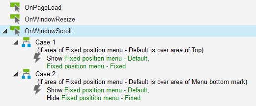
Fixed-position menus are often used on websites or applications today. They allow the menu (or any other toolbar) to remain always visible on top of the screen, no matter how far the users scrolls down. This interaction allows to create higher pages, without worrying about the user getting lost in the sitemap or worrying about finding the navigation again. Axure offers great interaction programming possibilities. And guess what? It is possible to prototype a fixed position menu with Axure, which only sticks to the top when relevant. Here is a ste-by-step tutorial to create a fixed position Axure element, including Axure source and prototype demo on Axshare.
Axure: Easy ghost text on text field

Simple text fields are a basic widget in Axure library, and one often needed. Instead of just dropping a text field on your interface design, here is a very simple way to implement faint-text (or ghost text) in them, improving the experience and giving it a real-life and one-step-further feeling. Let’s start by dropping your text field on your UI. You don’t even need to name the widget, but please put a text in it (let’s go with « I am a ghost text » in grey and italic, to show it’s a ghost).
Starting with Axure: a beginner’s guide

I used to say on my blog that I was a big Omnigraffle fan. And I definitely was. Just as I used to be a big Visio fan. But that was before: since then, I have discovered Axure. For budget or time reasons, most medium-sized agencies (the ones I have worked for at least) prefer not to invest in Axure. It is a complex software, and the licence price makes it a tough decision to invest money and time for the teams for self-training. Visio and Omnigraffle, or even Balsamiq, are definitely simpler to apprehend and start wireframing with. After a few months working with Axure, I figured I would give a few advice, based on my recent discovery of the software, to beginners who were afraid to make the move, just as I was. Please don’t get me wrong: I still like Omnigraffle a lot. But Axure has made my prototyping funnier and a lot more interactive.