Blog
Google Consumer Barometer and UX
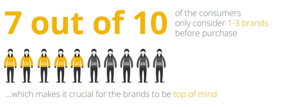
Started 4 years ago, Google Consumer Barometer is an free Web application offering consumer insights. Based on data collected by TNS through surveys in 50 countries, the tool presents main conclusions regarding consumption, online or locally, in different domains. A few conclusions are especially interesting for UX design, including the link between digital and physical stores, or how Internet is used in the buying process.
Main conclusions (for France in my example), are available in a PDF document, with nice data visualization. Another interesting aspect of this tool is that it lets you build your own graphs, based on the available data, through the Graph builder tab (top right.)
Circular progress bar in Axure
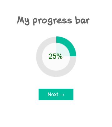
Data visualization is a more and more important part of UX projects nowadays, and an aspect of UX that I am really fond of. Among other elements of data visualization and dashboards, I have found myself recommending circular progress bars several times. Though, it is not an easy element to design within Axure, and referring to other softwares to design and edit my widgets was a bit inefficient. In this article, I propose an Axure source with a circular progress bar as a Master, that you can copy and paste directly in your own design. I won’t go as far as step-by-step tutorial, as it is ready to use, but simply explain a few of the possible options from this master.
Sticky element in Axure
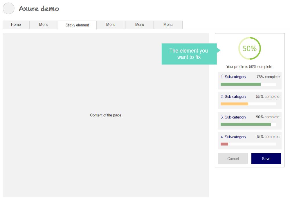
In a previous article on the blog, we have seen how to prototype a fixed-positioned menu in Axure. I realized this was a bit of a specific case, as the horizontal menu takes the whole page width, which makes it kind of easier. In this new tutorial, I propose to follow a step-by-step process to prototype a sticky element in the page. As a reminder, this applies when a simple Pin to browser is not sufficient, especially when the element to fix is not exactly on top of the page.
After TechNet @Bangkok
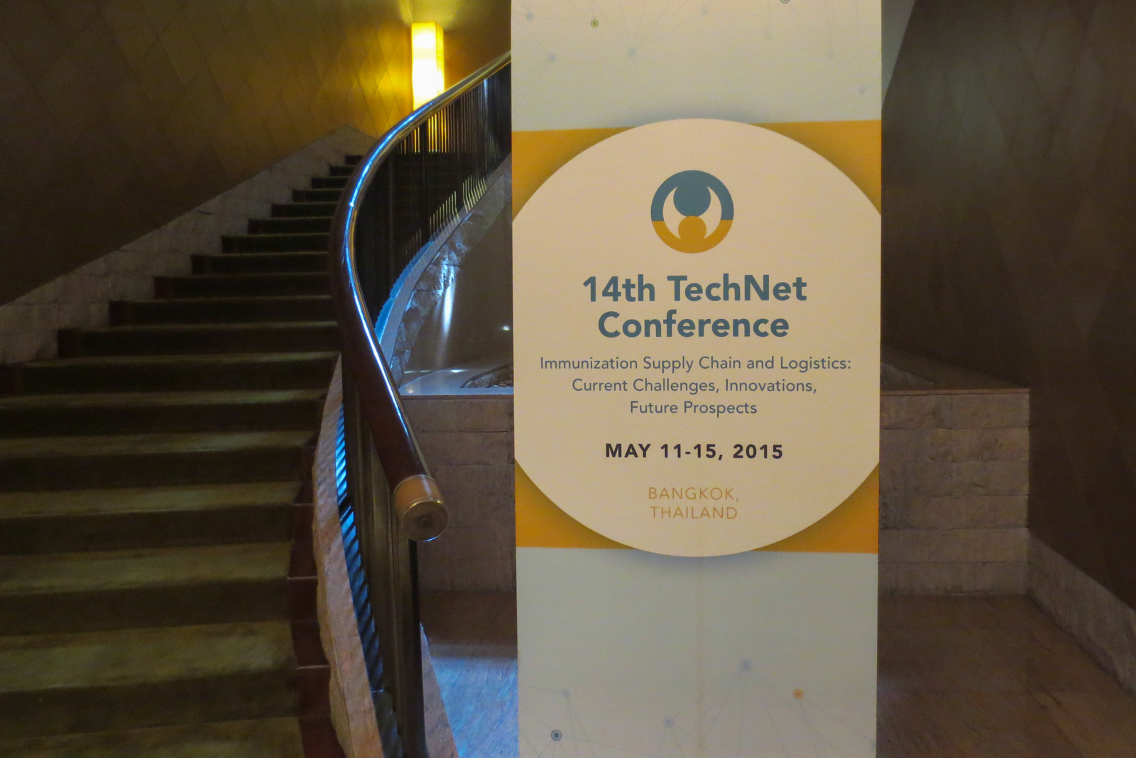
I am just back from the TechNet-21 conference, held in Bangkok, Thailand, from the 11th to the 15th May. As a reminder, this conference is organized by the World Health Organization and Unicef, and gathers immunization experts from all around the world to think and discuss about vaccination best practices and policy. I had the chance of being invited to this event in order to present a project, and gather feedbacks from present stakeholders. After a few months of preparation, we came up with a prototype and interactive wireframes.
@TechNet-21 Conference in Bangkok
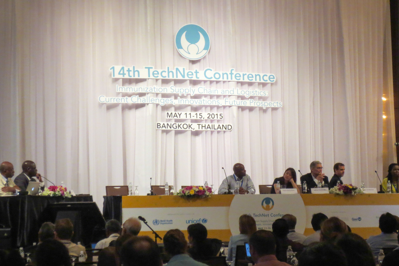
From the 11th to the 15th May, I have the chance of being invited to the WHO and Unicef TechNet-21 conference on immunization. During the 14th edition, held in Bangkok, Thailand, a global network of immunization professionals gather to share experiences, meet and discuss latest developments in immunization practices and policies. I am invited as a UX Consultant to present and test a new digital tool related to public health with present stakeholders and users.
User interview: my template

User interviews and observations are a great way (my favorite) to gather insightful feedbacks. More than subjective opinions of various stakeholders, observing how people use your interface to complete tasks is the best way to get objective, rational and unbiased insights. As Jakob Nielsen said, no need for thousands: 5 users allow you to identify most of UX issues. Same goes with the questions to ask during the interviews. You can’t come up unprepared, as this will lead to inexploitable, uncomparable data. But preparing a long list of questions is counterproductive, as you need to be careful not to lead the answers. As for me, I always use the same template of questions for my interviews. It is based on Avinash Kaushik’s 4 questions.