Blog: Trends and insights
Drive-to-Shazam TV ad

These days find me particularly sensitive to connected, cross-channels and cross-devices experiences. I have worked quite a lot on that kind of subjects for clients lately: today Brands can’t have a website, mobile applications and websites, ads, etc. independent as before. Same person uses them all, and all touch-points should be part of a unified experience. Even non-digital touch-points.
I was recently surprised by a 2-times ad on TV for Peugeot. The first part of the ad is very short. You can hear a music and a feminine voice invites you to open Shazam. For those of you who don’t use it, Shazam is an application that recognizes melodies and helps you find the name and author of a music piece as you hear it. I jumped on my favorite Wiko smartphone right on time before the second part of the ad.
The interesting point of it is that Shazam nearly instantly recognizes the background music, and drives you to a specific page on the app, dedicated to the ad! There, you are invited to discover the song and the product (a car.) I love this idea because it created a direct link between the Brand and me, from an impersonal TV message to my very own mobile phone. I also like that Shazam is a very modern app, that I would not have thought of for this use: I was more receptive and less defiant.
404 Error Pages: UX best practices

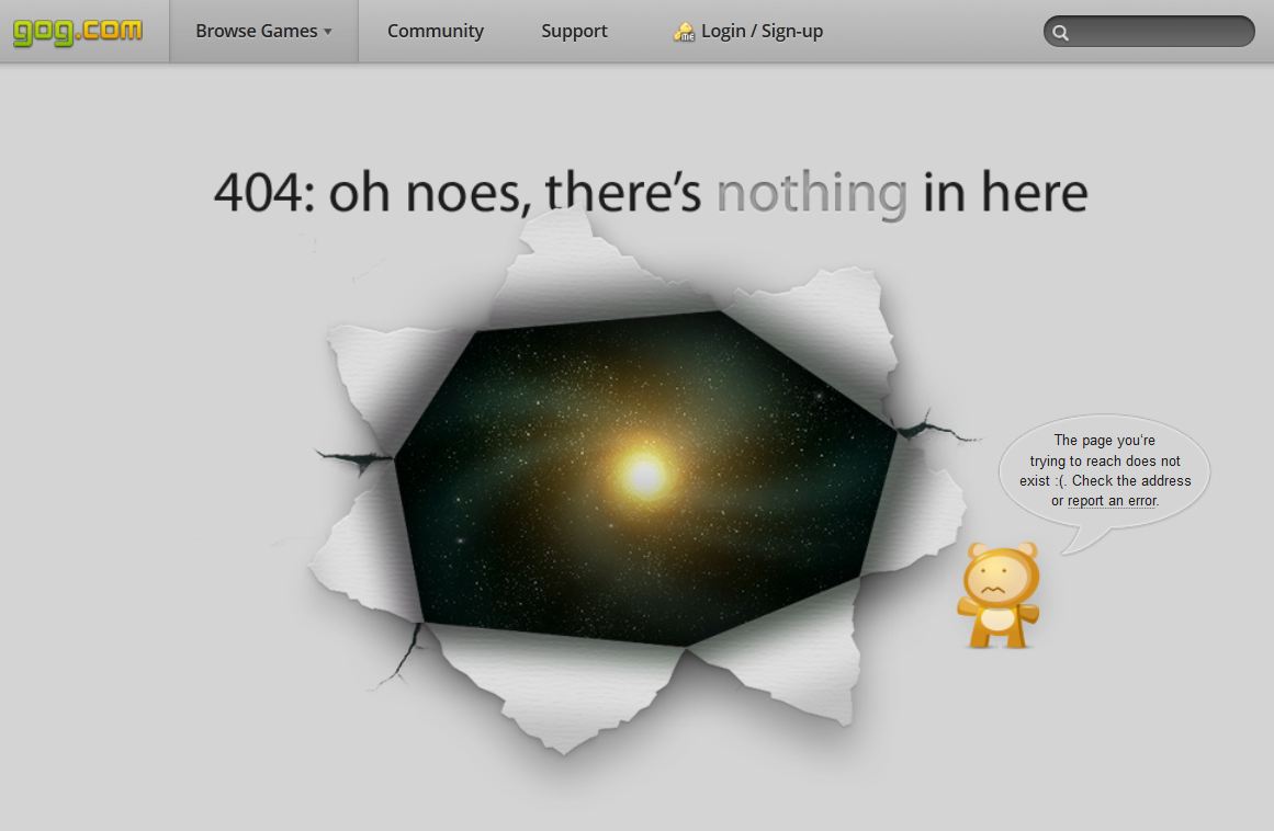
Uh oh, sorry but the page you are looking for cannot be found… Should a 404 error page stop with these very basic words? Nowadays 404 pages have become a creative challenge for websites, and some, like Gog.com or Blizzard.com, have really put some work to create unique and original pages. (There is also Videotron‘s unicorn… The simplest is to check benchmarks like 404notfound.fr.) But creativity is not the core objective of these pages, is it? When you look at the context, 404 pages appear when the user hastried to access a page that does not exist. It could be a mistake in the URL or a broken link on your website. This makes the 404 page’s main objective to redirect the user to relevant content, and avoid him closing the website and leaving forever. Here are a few ideas to improve 404 pages and go over the dead-end they once represented.
Summer sales on Internet: 2012 figures

Summer sales are an important moment for retailers. What influence do they have on Internet? What kind of behavior can an e-retailer expect from its users? Here is a very interesting diagram by ifop and spartoo.com, with a few figures on consumers’ special behaviors and expectations during Summer sales in France.
Neuromarketing Symposium (12/01)
On the 12th January, I had the chance to be invited by the student organization Sorbonne Symposium to their symposium on Neuromarketing. Neurosciences play a role in usability, and the symposium specially covered Functional Magnetic resonance imaging. The idea is to use a scanner (as used in a hospital) to measure the effect a website (or an ad, or any kind of stimulus) has on our brain activity. So we can measure (1) which functional zone is activated in our brain, (2) with which intensity, and (3) whether it is positive or a negative effect.
Shopping cart abandonment: a Google Analytics ad

Why do users abandon shopping carts? This very relevant ad for Google Analytics shows some evidence in an entertaining way. And I like it! Just wonder if your website doesn’t ask too many questions, or complicated data to recover. Everybody has to gain from a simpler buying process.
Footer optimization

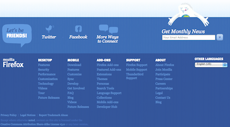
Big or small footer? I recently came to this question regarding an oline news website: is it stil a good thing to offer a big footer, with as many links as possible, and a summary of all keywords? The question remains unanswered speaking about SEO: it seems that multiple links in the footer can even be a bad point for Google, and here’s why: