Blog: UX tools
Beta-testing the new Axure 8
It has just been announced on twitter: Axure 8 is now available as a Beta version (download it here: buff.ly/1L6mlFK). Pretty exciting to test the new features this version has to offer. I am just downloading it as I write, but thought I would highlight some improvements that caught my eye on the release note:
Circular progress bar in Axure
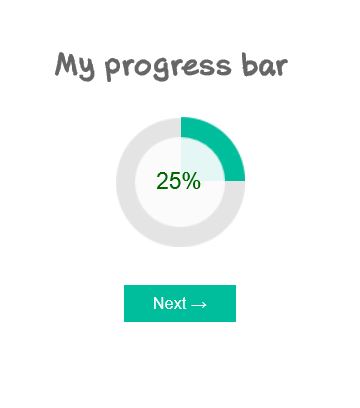
Data visualization is a more and more important part of UX projects nowadays, and an aspect of UX that I am really fond of. Among other elements of data visualization and dashboards, I have found myself recommending circular progress bars several times. Though, it is not an easy element to design within Axure, and referring to other softwares to design and edit my widgets was a bit inefficient. In this article, I propose an Axure source with a circular progress bar as a Master, that you can copy and paste directly in your own design. I won’t go as far as step-by-step tutorial, as it is ready to use, but simply explain a few of the possible options from this master.
Sticky element in Axure
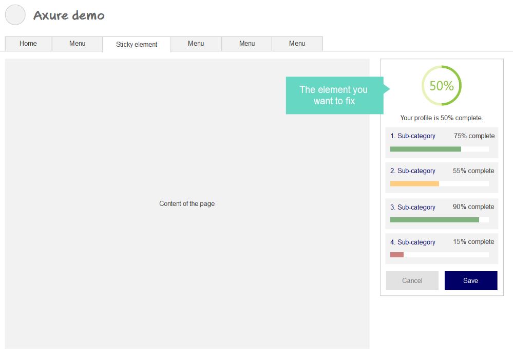
In a previous article on the blog, we have seen how to prototype a fixed-positioned menu in Axure. I realized this was a bit of a specific case, as the horizontal menu takes the whole page width, which makes it kind of easier. In this new tutorial, I propose to follow a step-by-step process to prototype a sticky element in the page. As a reminder, this applies when a simple Pin to browser is not sufficient, especially when the element to fix is not exactly on top of the page.
User interview: my template

User interviews and observations are a great way (my favorite) to gather insightful feedbacks. More than subjective opinions of various stakeholders, observing how people use your interface to complete tasks is the best way to get objective, rational and unbiased insights. As Jakob Nielsen said, no need for thousands: 5 users allow you to identify most of UX issues. Same goes with the questions to ask during the interviews. You can’t come up unprepared, as this will lead to inexploitable, uncomparable data. But preparing a long list of questions is counterproductive, as you need to be careful not to lead the answers. As for me, I always use the same template of questions for my interviews. It is based on Avinash Kaushik’s 4 questions.
Fixed position menu in Axure
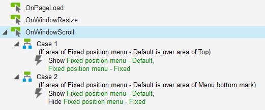
Fixed-position menus are often used on websites or applications today. They allow the menu (or any other toolbar) to remain always visible on top of the screen, no matter how far the users scrolls down. This interaction allows to create higher pages, without worrying about the user getting lost in the sitemap or worrying about finding the navigation again. Axure offers great interaction programming possibilities. And guess what? It is possible to prototype a fixed position menu with Axure, which only sticks to the top when relevant. Here is a ste-by-step tutorial to create a fixed position Axure element, including Axure source and prototype demo on Axshare.
Screen resolutions 2014
Mobile and tablets made appear a lot of new resolutions. Though, we still need to improve interfaces for « normal » desktop and laptop computers. In order to design for an optimal resolution, I rely on W3C Schools screen resolutions statistics. And in order to always keep in mind how many people I am potentially degrading the experience for if I design bigger, I sticked the following table close to my sight.