Blog: UX tools
Check actual screen resolution live – web-based
I usually rely on W3C Schools screen resolution statistics. Though, here and then we do need to have a precise resolution for a specific device. Of course the resolution can be found on the manufacturer’s website. But it takes some time, and it is the theoretical resolution. In the real world, this data is to be modified according to a lot of system’s elements that are added to the screen, and thus occupy some pixels: web browser address and navigation bars, scroll bars, etc. To be sure about the actual design space available on the device, I use Websitedimension.com’s Live Pixel check. The idea is very simple: a grid with a scale, allowing to easily count how many pixels can actually be displayed in height and width.
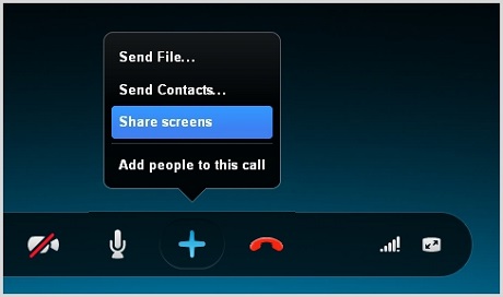
Conducting international User Observations with Skype

User observations are often key within the User Research phase. A privileged moment between the UX consultant and the system’s users, it gives a valuable insight on how users really use the system in a real-life context. On top of being an excellent base for building personas, scenarios and use cases, it is also a chance for the company to show that they care about users, and to build a relationship based on trust, which should later facilitate change acceptation.
Axure: Easy ghost text on text field

Simple text fields are a basic widget in Axure library, and one often needed. Instead of just dropping a text field on your interface design, here is a very simple way to implement faint-text (or ghost text) in them, improving the experience and giving it a real-life and one-step-further feeling. Let’s start by dropping your text field on your UI. You don’t even need to name the widget, but please put a text in it (let’s go with « I am a ghost text » in grey and italic, to show it’s a ghost).
Starting with Axure: a beginner’s guide

I used to say on my blog that I was a big Omnigraffle fan. And I definitely was. Just as I used to be a big Visio fan. But that was before: since then, I have discovered Axure. For budget or time reasons, most medium-sized agencies (the ones I have worked for at least) prefer not to invest in Axure. It is a complex software, and the licence price makes it a tough decision to invest money and time for the teams for self-training. Visio and Omnigraffle, or even Balsamiq, are definitely simpler to apprehend and start wireframing with. After a few months working with Axure, I figured I would give a few advice, based on my recent discovery of the software, to beginners who were afraid to make the move, just as I was. Please don’t get me wrong: I still like Omnigraffle a lot. But Axure has made my prototyping funnier and a lot more interactive.
Neuromarketing Symposium (12/01)
On the 12th January, I had the chance to be invited by the student organization Sorbonne Symposium to their symposium on Neuromarketing. Neurosciences play a role in usability, and the symposium specially covered Functional Magnetic resonance imaging. The idea is to use a scanner (as used in a hospital) to measure the effect a website (or an ad, or any kind of stimulus) has on our brain activity. So we can measure (1) which functional zone is activated in our brain, (2) with which intensity, and (3) whether it is positive or a negative effect.
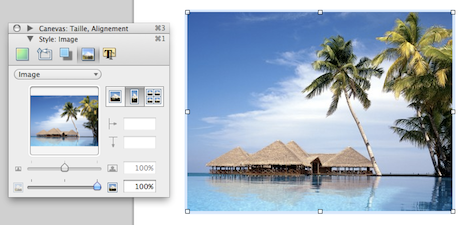
How to crop images in Omnigraffle

I’ve been using Omnigraffle for a few years now. But I only recently managed to crop images directly in it. It’s definitely useful, as it avoids opening Photoshop and lets you try different alternatives directly on your wireframe. It was quite evident in Visio, but quite hard to find in Omnigraffle, which makes it kind of a secret. Here is a few steps tutorial to learn how to crop images in Omnigraffle.