Animated dashboard with Axure 8
Axure 8 has recently been released as a Beta version for first testings. Reading the release note, a few improvements [...]

Data visualization is a more and more important part of UX projects nowadays, and an aspect of UX that I am really fond of. Among other elements of data visualization and dashboards, I have found myself recommending circular progress bars several times. Though, it is not an easy element to design within Axure, and referring to other softwares to design and edit my widgets was a bit inefficient. In this article, I propose an Axure source with a circular progress bar as a Master, that you can copy and paste directly in your own design. I won’t go as far as step-by-step tutorial, as it is ready to use, but simply explain a few of the possible options from this master.
View the HTML prototype demo on Axshare or download Axure source
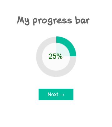
To insert the circular progress bar in your Axure design, simply copy the element in the first page, and paste it in your own design. There are several masters copied with it. Circular progress bar lists the 5 different states of progress: 0, 25, 50, 75 and 100% completion. These states are named 1, 2, 3, 4 and 5, as this allows to program a random selection (I will detail this option in a later article.)
To change the green color, simply open the Master named « To change color », and select the preferred color. It will automatically change the color on all states of progress. Just a one-time simple action to change the color everywhere.
By default, the circular progress bar is set to display 0% completion. To edit level of progress displayed, use a simple Set panel state to (1, 2, 3, 4 or 5), on click on a button or on page load, for example. Please note that you can insert several circular progress bars in one same page, and set each one at a different state of progress. We will see in a next article how to insert several masters in the page and set them to a random state.
In the Axure file, you will also find another page, with a few forms fields. This example shows how completion of fields can trigger a change in progress on widget, and how it can enable the Sumbit button at the bottom.
I am afraid there is no easy way to resize the element. You are going to have to resize each of the copied Masters plus realign and resize each state of the Circular progress bar, one by one. I estimate this operation would not take more than 10 minutes though. And as it is a Master, you only have to make the changes once.

