404 Error Pages: UX best practices
Uh oh, sorry but the page you are looking for cannot be found… Should a 404 error page stop with these very basic [...]

I have been asked a question about accessibility recently, and I realized it has been a long time since I’ve last heard about it. A way too long time. Accessibility means building something -a cinema, a concert hall, a shopping mall, a website, etc.- usable by persons with disabilities. Usability is the beginning of an accessible process: isn’t our job to make sure everyone can use our applications? Though it is just one step further. Isn’t it just normal? Why couldn’t a person with disabilities read a website, when she can enter a cinema, because nobody thought of making it readable for her? In this article, I decided to make accessibility a little more concrete. How? Well, I spent 1 hour browsing the Web with a text-only browser, Lynx. The conclusion of this article introduces to accessibility basic best practices by WAI.

Every web designer knows about accessibility. More like a dream than as real rules to apply. Though, accessibility is needed by a lot of persons all over the world. The most easy to understand type of needs refers to visitors with seing problems. We’re talking about blindness, but also aging-related conditions, color blindness, dyslexia, etc. Their handicap prevents them from using the Web like every other users. Besides seing problems, persons with listening issues are also a special public to consider, just like seniors, nervous diseases, etc.
Last week, one of the websites I’ve worked on for usability was put online. Very fast, the same day actually, hundreds of negative comments appeared. Visitors were scared, lost, angry. Why? 80% comments were about the font size. The design agency had chosen a Serif font, and the size was very small, which made it hardly readable, moreover for the main 50 years old visitors public. So accessibility is a concern we should worry about, as information architects, but also as webdesigners, programmers and visitors.
To determine if your website is accessible, the easiest and quickest way is to use one of many free accessibility validation tools. I tried and appreciated Fujitsu Web Accessibility Inspector, but I didn’t examine carefully all criteria analyzed. The most exhaustive way would be to go through W3C/WAI 2.0 guidelines and validate them one by one, but of course, that would be much longer.
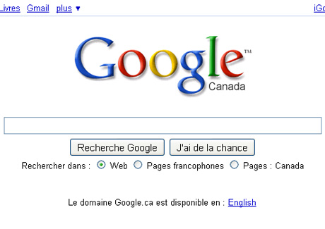
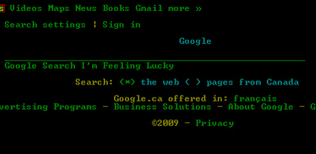
There are three ways of answering this question, First, do you know what your website looks like in a text-only browser? Well, let’s take an example to illustrate this. Let’s take… Google. Like me, you probably think Google home page is perfect speaking about usability. Well, please have a look at the following images:
Google as we see it with a standard browser (Firefox, not to name it):

Google as we see it with Lynx:

So, what do you think? I was totally surprised! I tried to browse for some time with Lynx, but I must say it’s incredibly difficult. Besides WAi website, which of course is perfect, websites are absolutely not made for text-only. But it goes further, as text-only is the first step to accessibility. Braille emulators, among other alternative devices, base on text to translate and adapt the content. It just adds even more complexity.
The second answer to the question is that it is very simple to make your website approximately accessible. The WAI basic rules are nothing complicated, and often included in other best practices (like ALT to images for SEO, etc.) So why not make the effort?
And finally, the last answer refers to Web feelings. Why should persons with disabilities not have access to Internet? Isn’t it supposed to be for everyone? An open place? Where does this idea that only medical-related websites or gouvernmental applications should be accessible? Come on, persons with disabilities should be able to use Google as easily as everyone else, shouldn’t they?
I’m not the best person to speak about technical rules (and this article is already quite long), so I’ll just link to WAI quick reference to WAI 2.0 rules.
