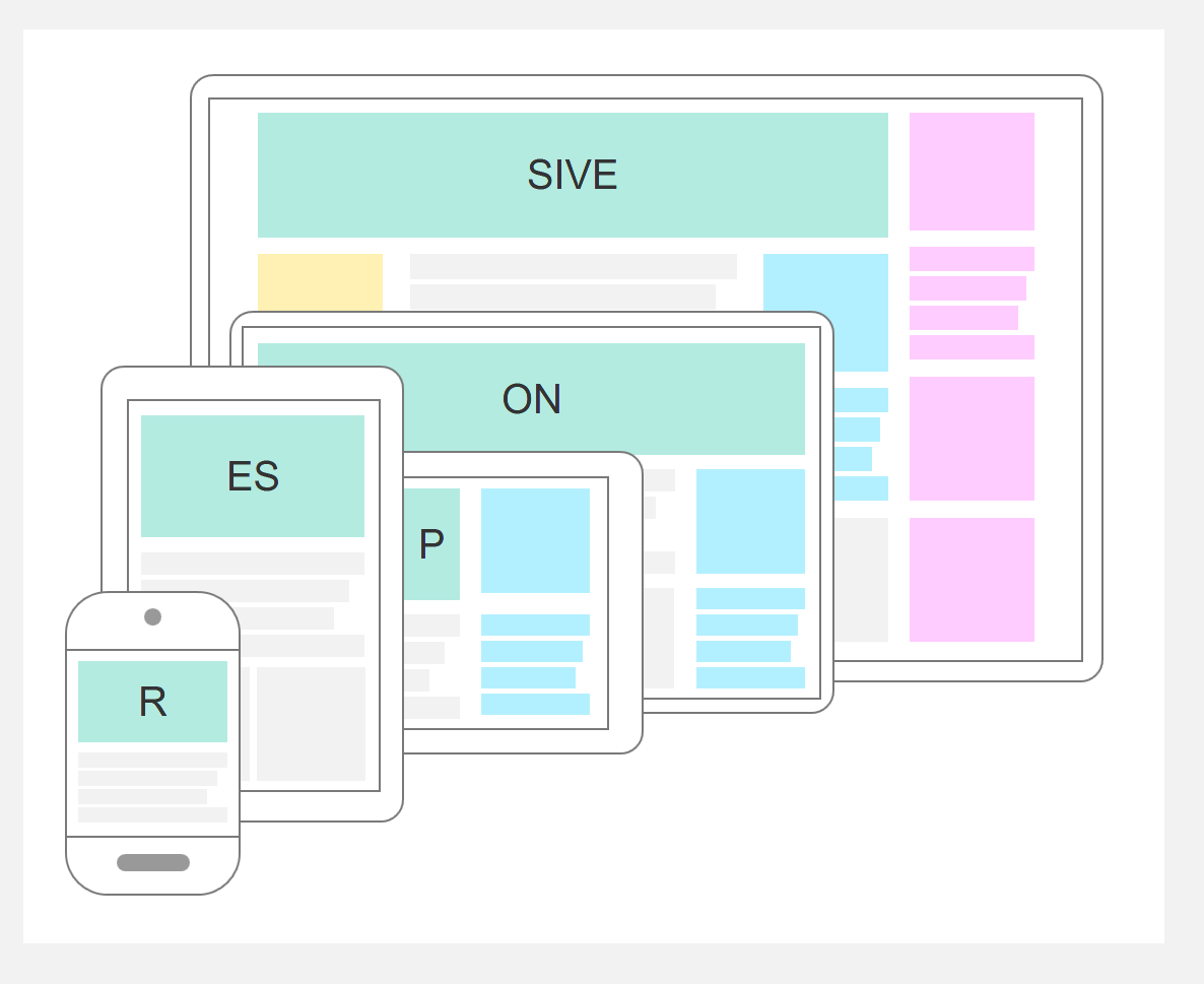
Screen resolutions 2014
Mobile and tablets made appear a lot of new resolutions. Though, we still need to improve interfaces for « normal » [...]

With Internet users surfing more and more from their smartphone, the question of screen resolutions has become a major challenge for webdesign. Thinking a website interface for 1024 or 1280 pixels-width is not what matters any longer. No, the challenge has grown and become bigger… which in this case actualy means smaller. A website is now expected to adapt to the screen each visitor sees it within. There are several techniques and methodologies around this new challenge for UX mobile, including adaptive design, responsive design and mobile-first strategy. Each of them presents new opportunities, challenges and risks for the conception of user experience.
One common mistake is to assume users have the same needs and expectations on a mobile vs. on their desktop. But the matter is larger than just offering the same contents on different platforms. On a mobile, users have smaller screens (obviously), a limited connectivity and very limited patience level. They want to go to the point. No one likes to scroll long pages on a smartphone: the important content has to pop up.
Moreover, mobile users can be anywhere: on a train, on the street looking to get to your office or store, showing your product at friends’, etc. Location and contact are the most useful contents that need to be highlighted in mobile more.
Good practices:

An interface is called adaptive when its elements are automatically resized according to the browser window. Feel free to try on this website by resizing the window of your Web browser: the elements of the page (like the text width) change size to fit the new viewing space. No horizontal scroll. This is a first and necessary step, that allows to cover resolutions between the breakpoints. But this has its limits: if you resize the viewport to an extremely small width, the elements will start to look bad and content will not be easily readable.
The next step is called responsive. The idea here is to have different layouts according to the viewport. For example, the interface can be based on a 4-columns layout when the resolution is bigger than 1200, 3-columns between 992 and 1200, 2-columns between 768 and 992, and 1-column when the resolution is smaller than 768 pixels. All these threshold resolutions are called breakpoints. They will determine which layout to display according to the viewport. (The breakpoints mentioned in this article are based on Bootstrap guides.)
Responsive is a strategy, and not an easy-to-plug option afterwards. It has to lead the design process.
Of course, the breakpoints can change, especially as the smartphones technologies change very quickly. If the minimum solution is to make sure mobile users have a good display of the content on their smartphone, it is also important to ensure users with tablets, desktops and very large screens are viewing your website in the best possible way, without too much lost space, with elements at the right size, and no horizontal scrolling. As always, it all depends on your users.
Good practices:
As small mobile viewports are the most restrictive scenario, it is highly recommended to start with mobile design. It will be much easier afterwards to display the content in bigger resolutions than try to fit everything from a big to a small screen. Though, this also has its challenges. The most important one I have come accross is business validation. Stakeholders still prefer to see a desktop version to make up their mind and give feedbacks. When presented with only the mobile version, they often have trouble projecting themselves.
To deal with that issue (afterall UX is all about getting insights), I work mobile-first internally, but present the whole design concept to the stakeholders, showing at the same time the different responsive versions.
My favorite software (Axure) does include a responsive design feature. It does help you in a way, as you can automatically copy and paste contents from one resolution to another, and some of them automatically adapt. That being said, it becomes quite unefficient once you get to a large amount of pages and elements within the pages. My advice is to use the responsive feature for smaller projects, and separate responsive versions in different pages and folders for bigger projects. It can seem harder to maintain, but in the end I found that correcting automated bugs would take me more time.
Finally, I want to attract your attention on testing. Of course, everything has to be tested on all responsive versions. And that has to be done for each change. Luckily, there are some very useful tools, like Google Developer tools, helping to simulate different viewports on the same device.
Mobile applications are different from a website: they need to be installed by the user, can generate notifications on the device, be used offline and offer richer interactions, etc. A responsive website does not replace an application, and vice-versa. You can have both, as soon as your application offers a service (catalog, game, orders, etc.) The costs are unrelated to the website development, and this would be a completely different project.

